

Problem Statement:
Users of the One Another platform need a simple and efficient way to reach out to members of their communities to request or offer help with daily tasks.
Solution:
The recommended solution was redesigning the user interface and underlying information architecture to improve usability, alongside refining the copy and visual style to develop and create a more approachable platform.
Roles
Team
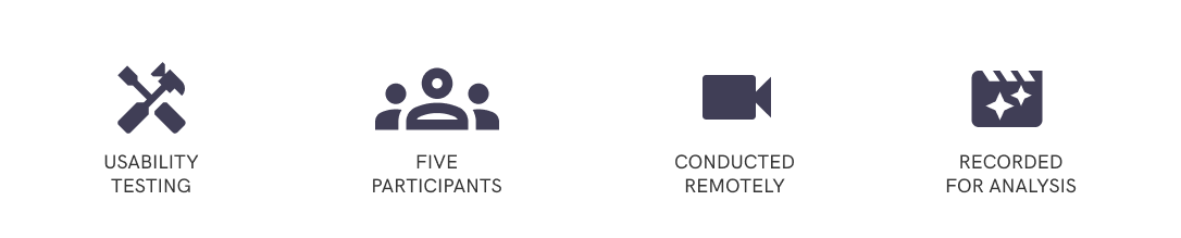
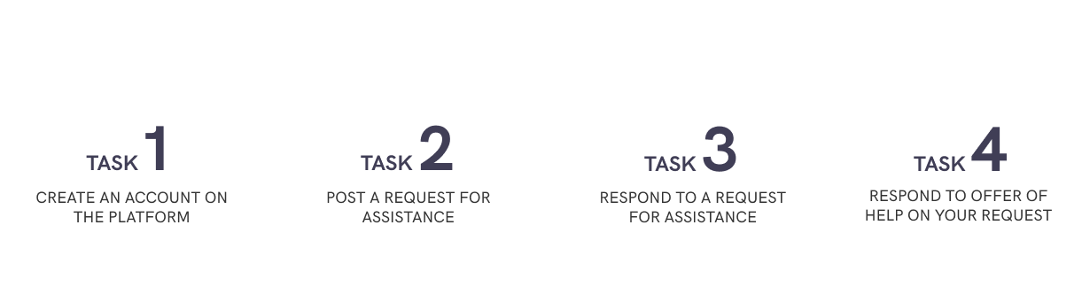
After identifying some usability issues with the platform, I
decided to conduct usability testing. I undertook the testing with
five participants, following the 'talk-aloud' approach to
understand their experiences completing a series of tasks on the
application. These tests were conducted remotely through video
meetings which we recorded to analyse and evaluate the issues by
severity.
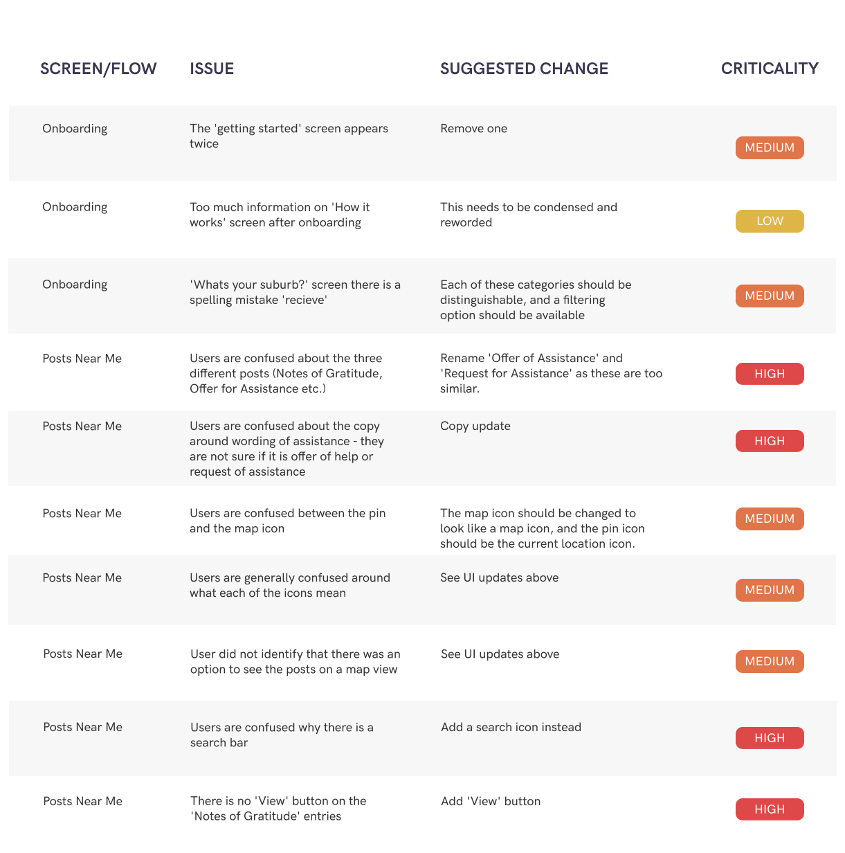
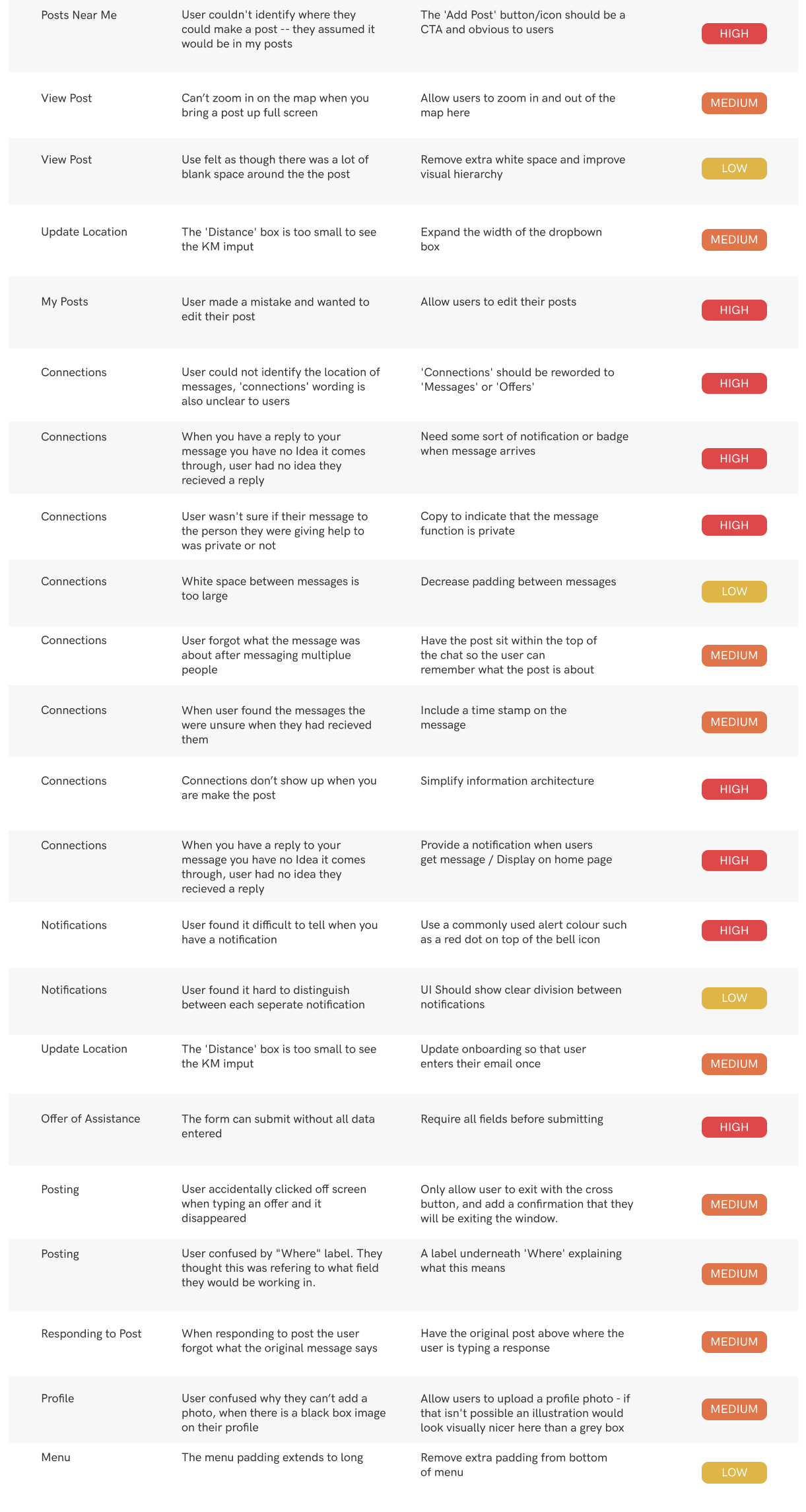
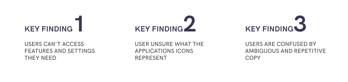
Usability Testing Findings
The recordings were analysed and findings from this user research were tabled, categorised and tagged by severity. From the user testing we discovered three key findings to explore in the redesign.
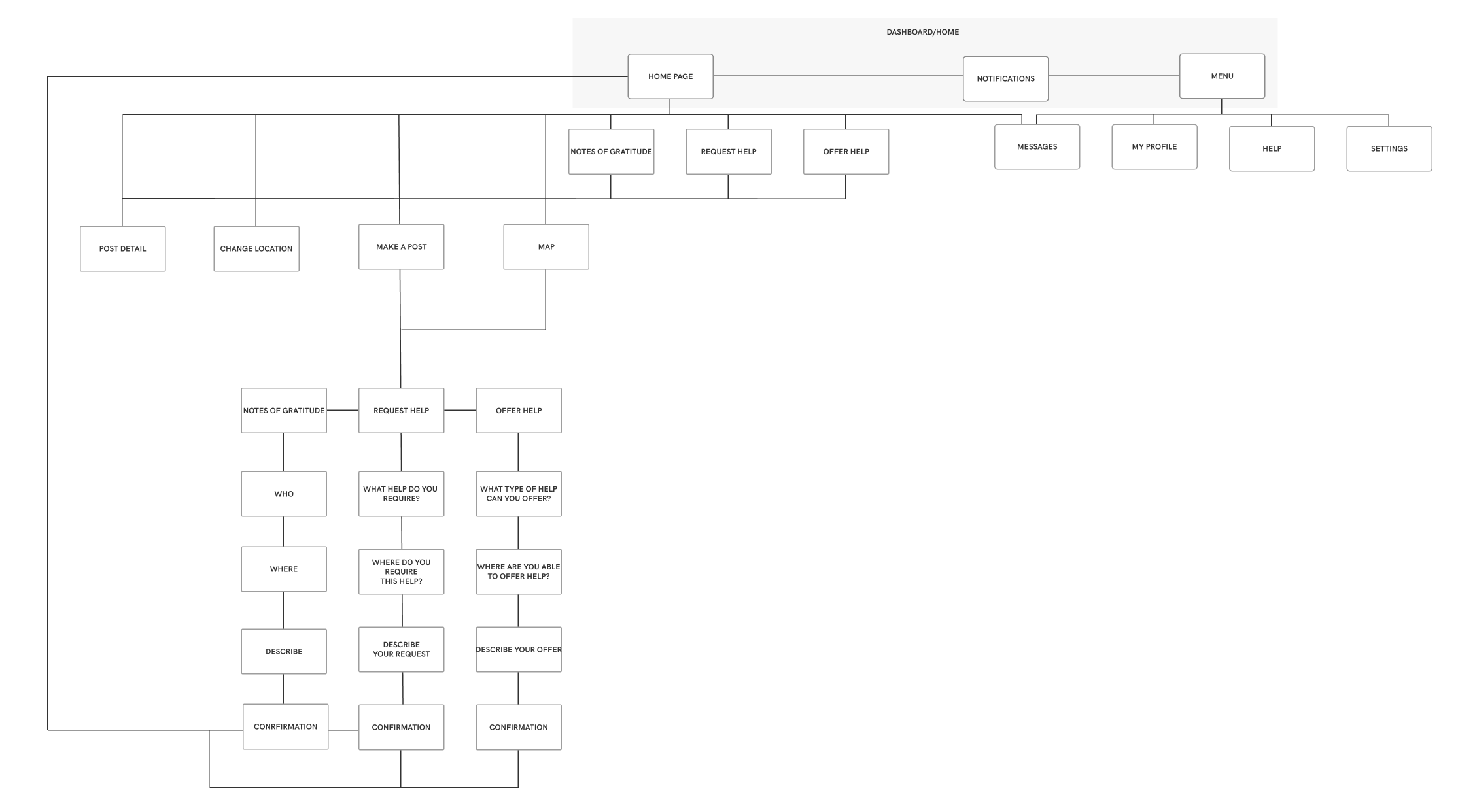
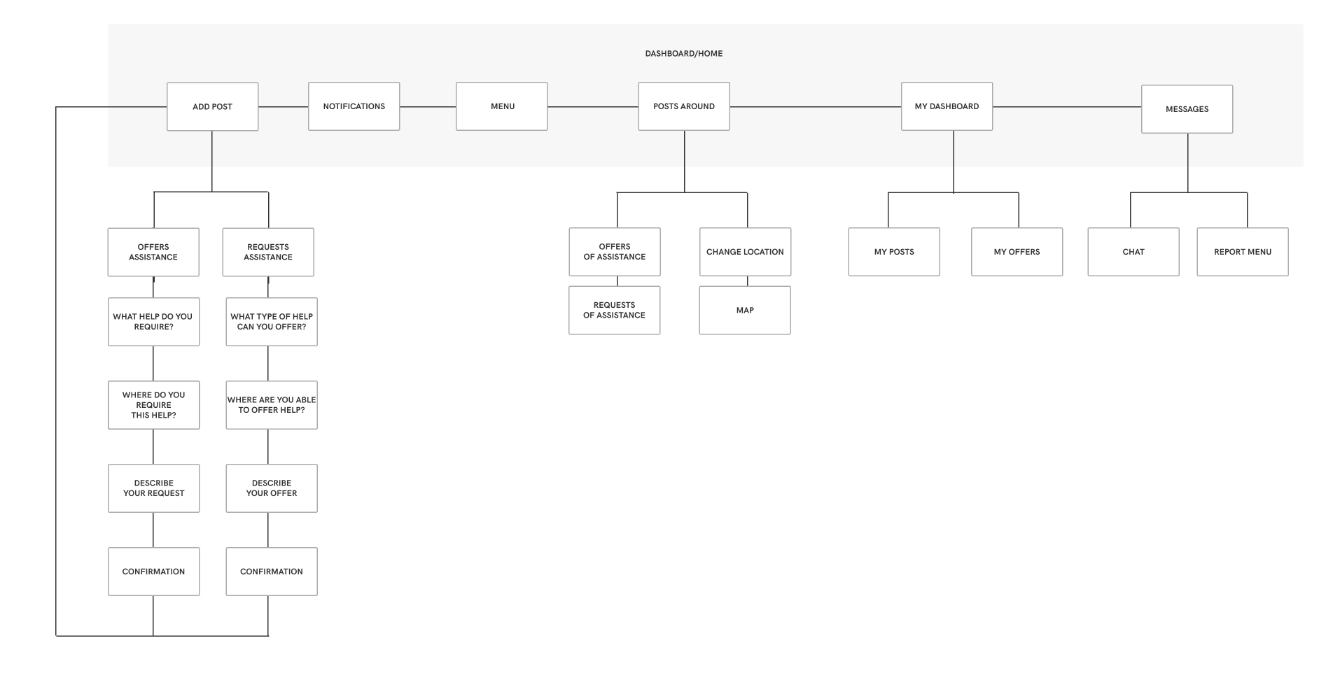
Information Architecture Update
The user research findings indicated that users struggled to navigate to certain features within the application due to the applications information architecture. I examined the user flows to simplify the information architecture. This was achieved by minimising the steps required for users to access the functionality within the application.
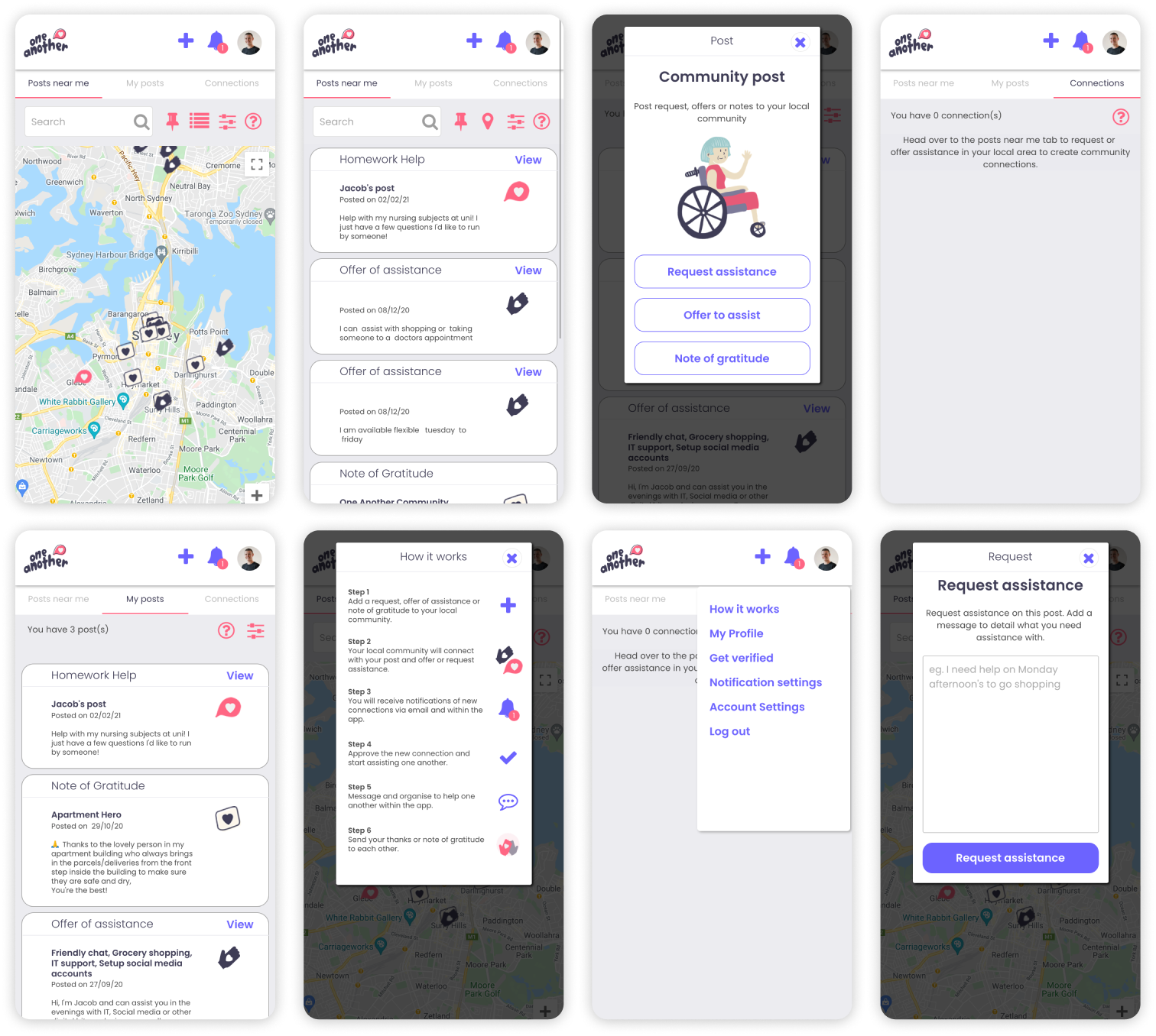
Previous Information Architecture
Updated Information Architecture
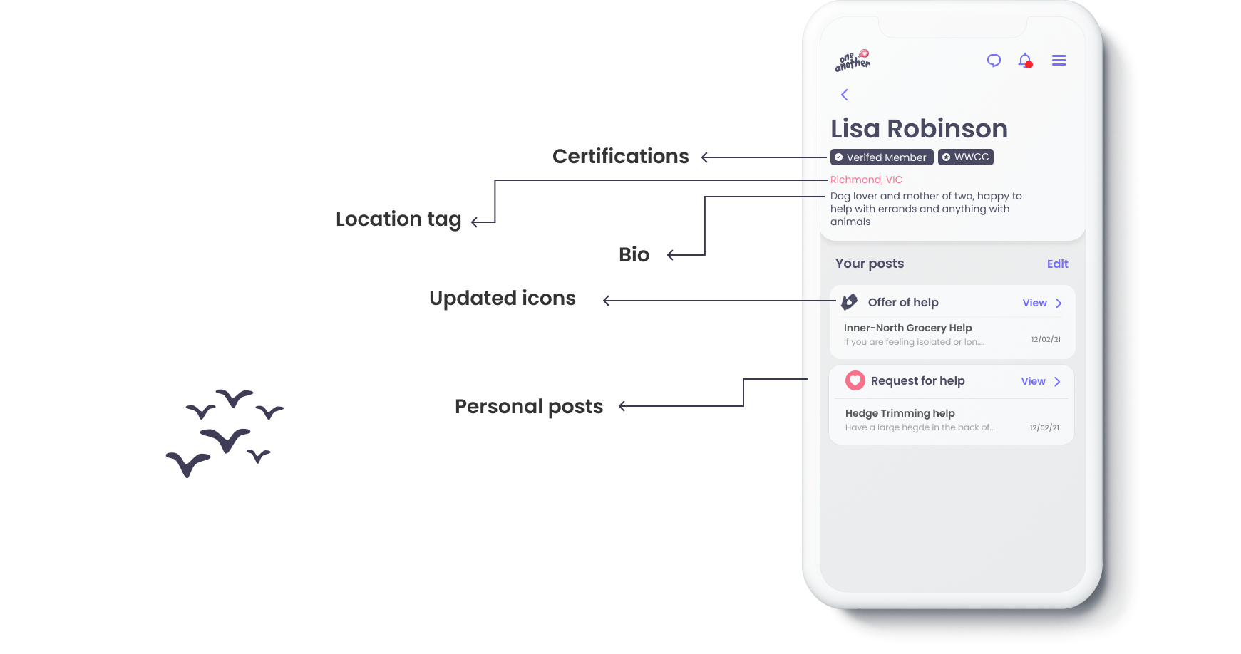
User Interface Redesign
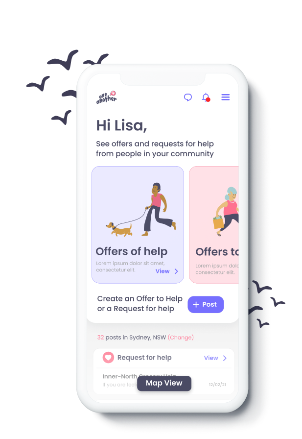
I redesigned the user interface to bring the key functionality to the dashboard. This included providing more visuality to the user about the actions that can be undertaken in the platform whilst maintaining a primary focus on offers and requests for help.
Previous User Interface
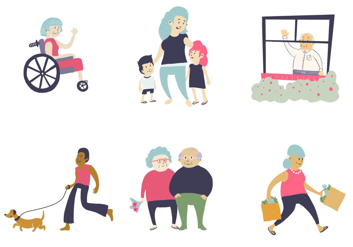
Adding Personality
Based on feedback from the user testing, suggesting that the application feels a little bland, I noticed a huge opportunity to add illustrations into the applications design. This aims to provide a more friendly tone to the platform and put users at ease making them feel comfortable offering or requesting help.
Softening the Edges
By refining the design of the cards, buttons and visual identity the application feels softer and more inviting. This was continued by adding soft colours to give a gentle highlight to key distinct elements of the application. This mood was echoed in other design elements by increasing the corner radius of the applications user interface to allow for more rounded elements.
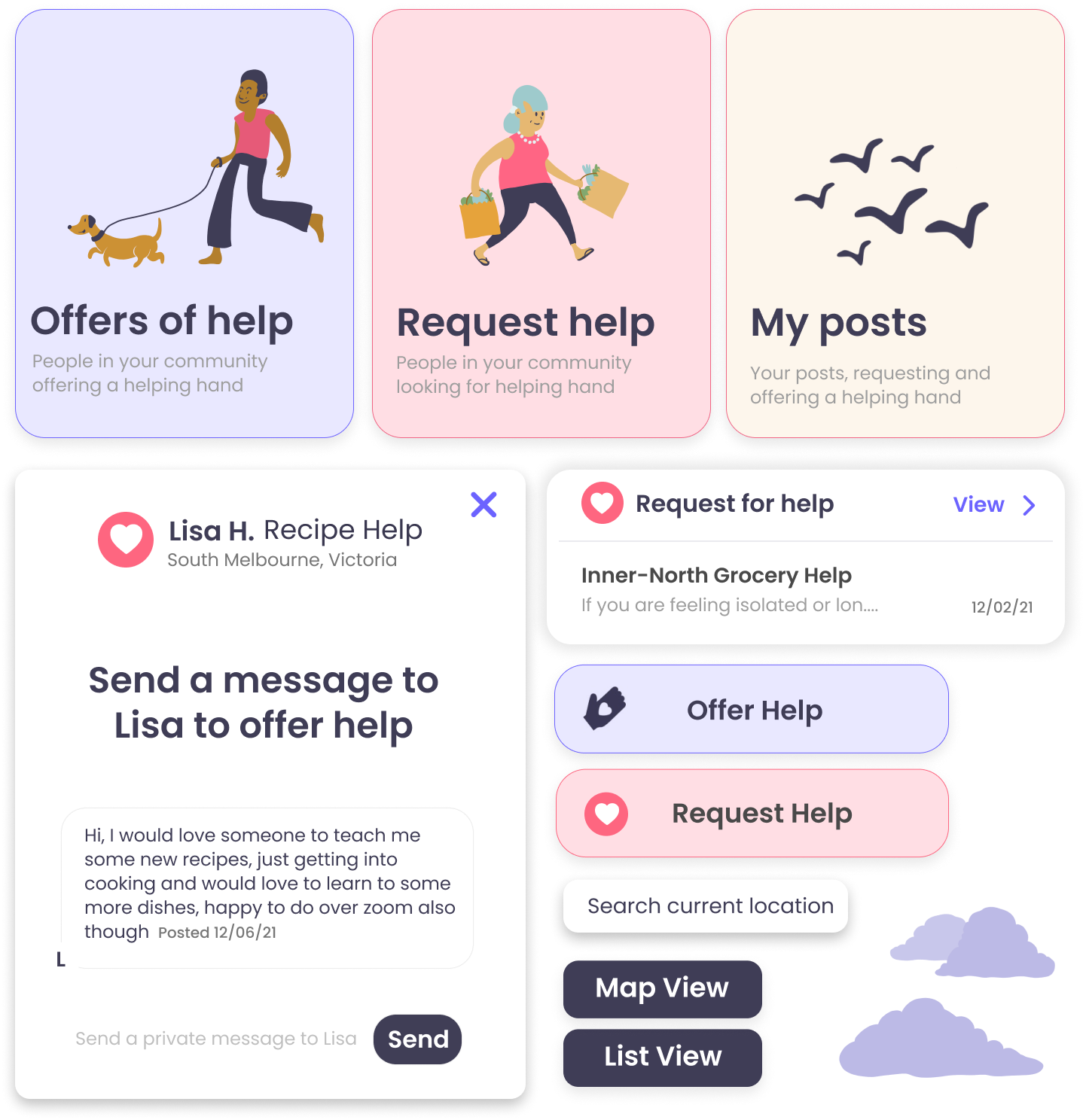
Updated User Interface
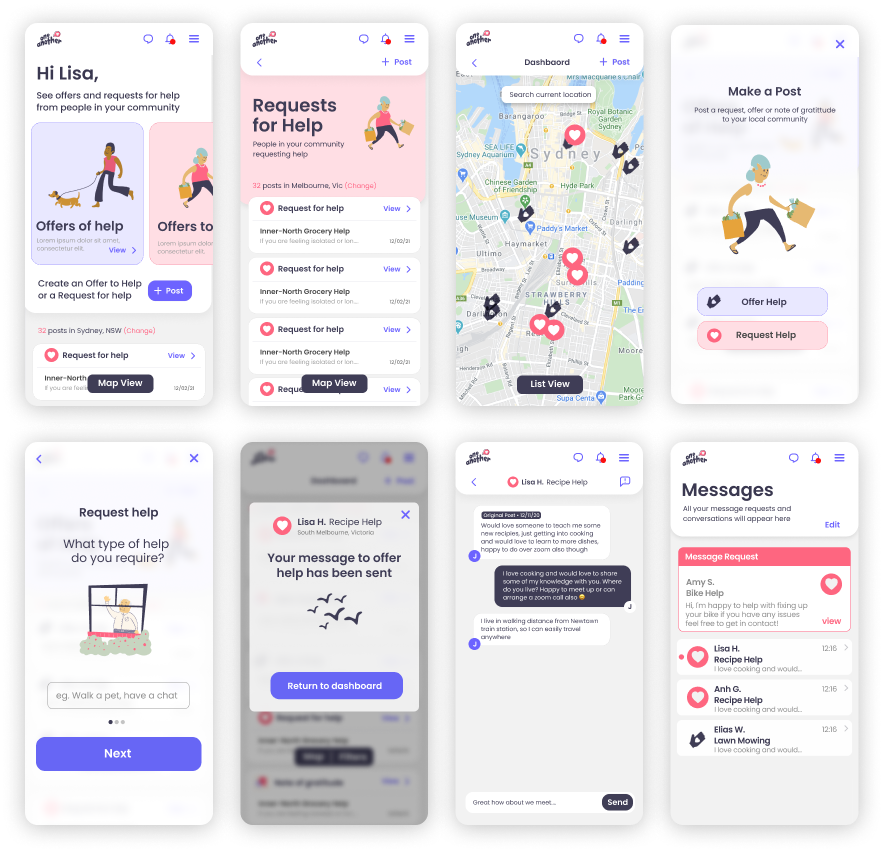
Updated User Interface
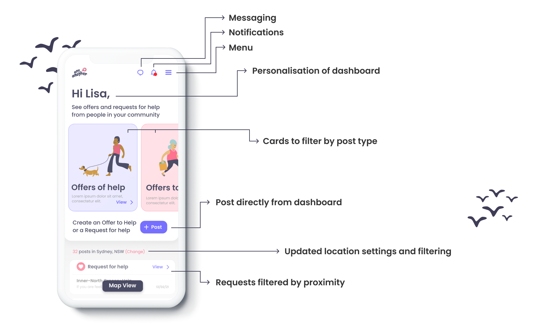
Updated User Interface
Relaunch
The updated user interface was implemented by the development team
before the application was relaunched with iOS and Android native
applications. Upon relaunch, the application saw a 50% increase in
users over the first month.
Next steps
Further user testing should be conducted to analyse the user flows
to validate the designs and provide recommendations for future
iterations.
The micro-copy and labels on the application, especially
surrounding the 'offers to help' and 'offers of help' should also
be validated in focus groups to ensure all functionality is easy
to navigate and understand.